Soul Capital
Soul Capital
Soul Capital have been leading impact investment in New Zealand since 2014. After a decade of building their approach, they needed a brand to carry the reputation that came with it. We worked with them to define the idea underneath the conviction, then shaped an identity that lets them lead with confidence.
The Context
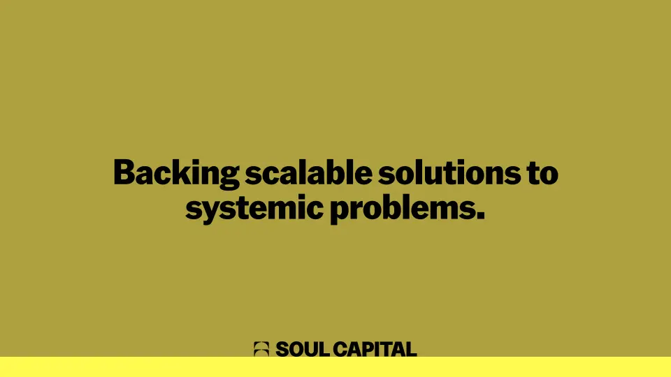
Soul Capital have been leading impact investment in Aotearoa New Zealand for over a decade, when the category barely existed here. In that time, they've become known as the people who do ‘impact for real’. They not only take a multi-asset approach in backing solutions to systemic problems, but do so with a rare level of care, discipline and integrity.
When we connected with Soul, they were into their second fund, and the work was far stronger than the brand representing it. Our brief was to help close that gap.
When we connected with Soul, they were into their second fund, and the work was far stronger than the brand representing it. Our brief was to help close that gap.
The Problem
The bigger problem to solve actually sits in the wider investment category. Impact investing is still commonly understood as ‘do good’ capital, something that happens alongside serious investing rather than a powerful option within it. When the signals investors rely on, like risk, return and track record, don't map as neatly, even those with strong intent find it hard to place. And being hard to place makes it hard to back.
That presents an emotional problem. Impact investing doesn’t often feel like a credible opportunity where the real upside is.
Soul's previous brand reflected the category's challenge rather than answering it. The rigour and quality of their work weren't coming through, and what they needed was a brand with the same conviction as the people behind it.
That presents an emotional problem. Impact investing doesn’t often feel like a credible opportunity where the real upside is.
Soul's previous brand reflected the category's challenge rather than answering it. The rigour and quality of their work weren't coming through, and what they needed was a brand with the same conviction as the people behind it.
The Idea
Our goal was to present impact investing as credible and confident, to help shift the category from justifying its own existence and move it into a place of conviction. The temptation was to earn that confidence with bigger promises about outcomes. But the more time we spent with Soul, the more we understood it was less about lofty promises, and more the approach they take with their investments.
Soul thinks in generations, systems and second and third order effects. Their conviction comes from what they believe the future needs, and they boldly commit to acting on it. They’re unafraid of venturing into unchartered territory and the complexity that comes with it. They’ll do the hard thing because it's the right thing.
This formed the brand idea “Move where it matters”. It captures the posture of going early where the need is greatest, thinking in systems and generations, and doing it all with the care and rigour Soul have become known for.
Soul thinks in generations, systems and second and third order effects. Their conviction comes from what they believe the future needs, and they boldly commit to acting on it. They’re unafraid of venturing into unchartered territory and the complexity that comes with it. They’ll do the hard thing because it's the right thing.
This formed the brand idea “Move where it matters”. It captures the posture of going early where the need is greatest, thinking in systems and generations, and doing it all with the care and rigour Soul have become known for.
The Identity
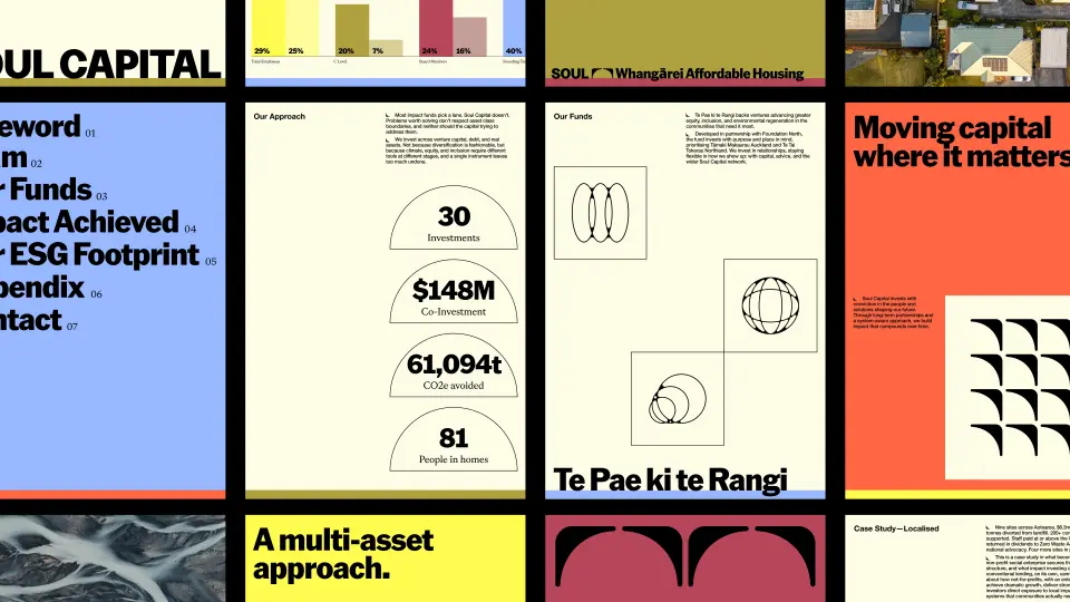
The identity translates Soul's conviction into a visual system built on the power of partnership, compounding growth and connected impact. Designed to challenge the conventions of the investment category, it balances a progressive outlook with the confidence and longevity of an established brand.
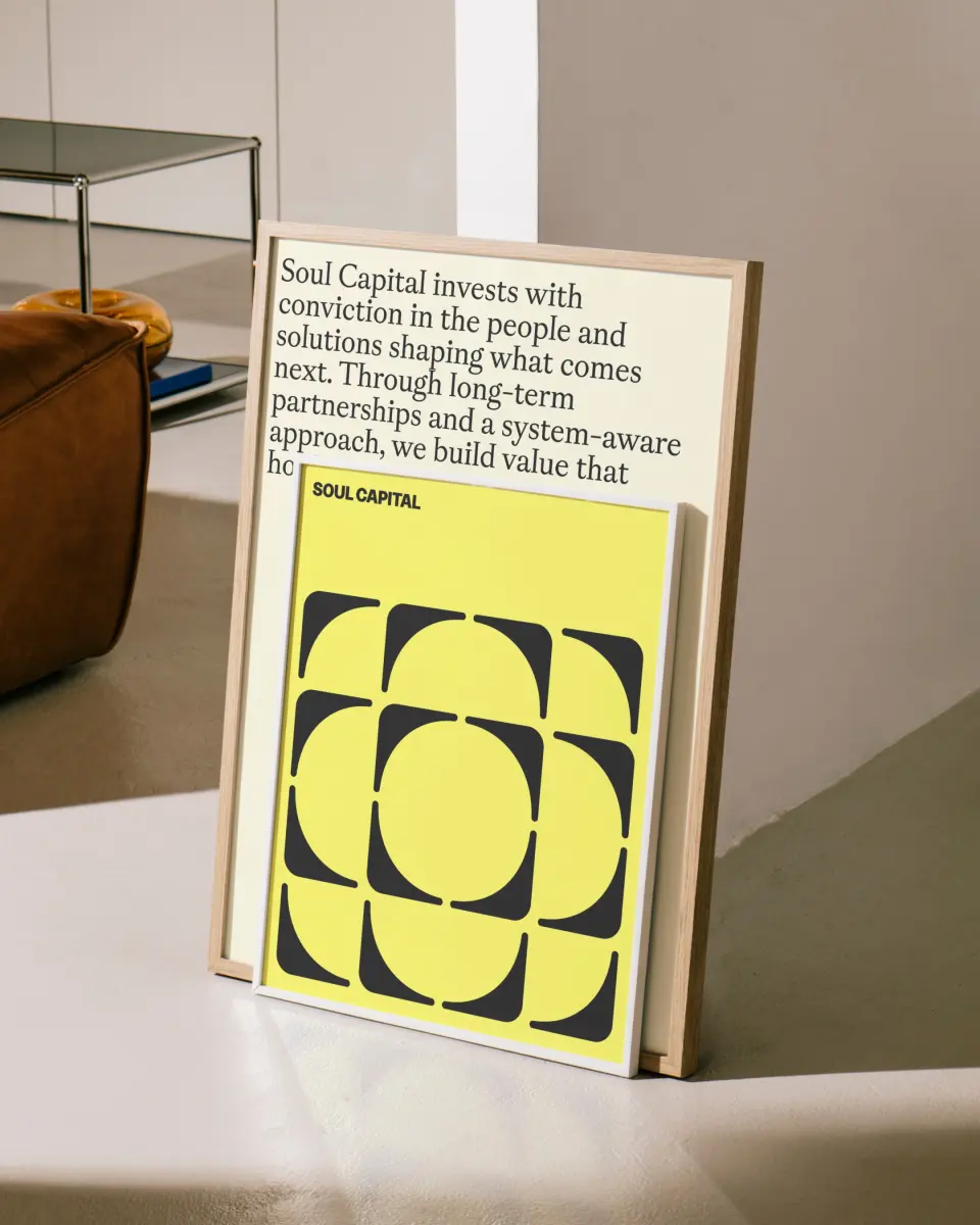
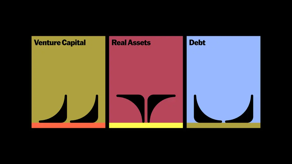
At its heart is a bold, dynamic symbol built on the idea of connection. Beginning as a singular arrow, the form doubles to represent partnership, then builds upwards to express generational thinking and the compounding nature of impact. In its complete form, it becomes a distinctive maker's mark, a symbol of Soul and everything they stand for. This same logic extends into a graphic language that shifts and moves with intention, reflecting Soul's philosophy of moving when it matters and bringing their systems-led thinking to life.
A horizon line acts as a unifying thread throughout the identity, reflecting Soul's long-term perspective and the expansive possibilities of impact investing. Both a storytelling and functional device, it creates consistency across touchpoints, from art direction to everyday communications.
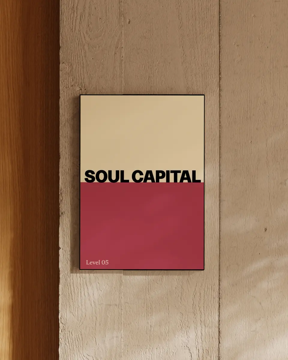
A soft, colourful palette brings warmth and humanity to a traditionally conservative category. Paired with a layered yet confident typographic system, led by Klim Type Foundry's American Grotesk, the identity balances conviction with character. The result is a brand that feels distinctly human, progressive and grounded, with the flexibility to grow alongside Soul's ambitions.
At its heart is a bold, dynamic symbol built on the idea of connection. Beginning as a singular arrow, the form doubles to represent partnership, then builds upwards to express generational thinking and the compounding nature of impact. In its complete form, it becomes a distinctive maker's mark, a symbol of Soul and everything they stand for. This same logic extends into a graphic language that shifts and moves with intention, reflecting Soul's philosophy of moving when it matters and bringing their systems-led thinking to life.
A horizon line acts as a unifying thread throughout the identity, reflecting Soul's long-term perspective and the expansive possibilities of impact investing. Both a storytelling and functional device, it creates consistency across touchpoints, from art direction to everyday communications.
A soft, colourful palette brings warmth and humanity to a traditionally conservative category. Paired with a layered yet confident typographic system, led by Klim Type Foundry's American Grotesk, the identity balances conviction with character. The result is a brand that feels distinctly human, progressive and grounded, with the flexibility to grow alongside Soul's ambitions.


Featured Projects












Get in touch
We take on select projects, working with companies who are inventing or reinventing. If there’s a project you’d like to talk to us about, please get in touch.
Thank you for your message! We'll be in touch.